Top 10 Graphic Design Tips for 2019 – By Amani Youssef
I always find the best way to come up with new designs all the time is to be involved in the industry, be it following your favourite designer’s blogs or social media pages.
It’s always a good idea to be looking for inspiration.
That’s why I decided to do this blog post, to help up and coming graphic designers and give them tips on how to improve their designs.
1 – Inspiration is key

Whenever I am taking on a new client and researching their ideas, I always spend time gathering designs from all around the world as inspiration.
With today’s technology, it is now easier than ever.
There are quite a few sources for amazing inspiration for designers.
I like to follow Graphic Design tags on Pinterest – Pinterest is a fantastic place to get inspired!
Viewing other graphic designers work from all around the world can really help when feeling stuck.
Most of my inspiration comes from high fashion brands, looking online at the latest high fashion packaging, invitations are so inspiring.
Depending on your style of design you will find different things will inspire your design work, Explore this!
A regular haunt of mine is Behance.
It is full of talented designers from all around the world.
It is also an excellent place for you to showcase your work and give inspiration to others.
2 – White Space is our friend
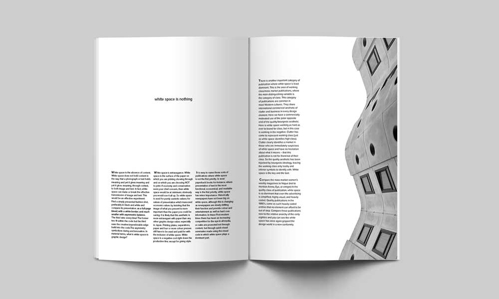
A see many designers try to over complicate things or try to fit in too much.
From my experience, LESS IS MORE.
Always try to keep everything to a minimum; this is what will be remembered and is necessary for brand recognition.
Try to shorten the message and get more to the point.
After all, people will not read the entire message, so focus on the main point to get across.
Do not be afraid of white space, it is your friend, and it helps to emphasise the actual message.
3 – Colour
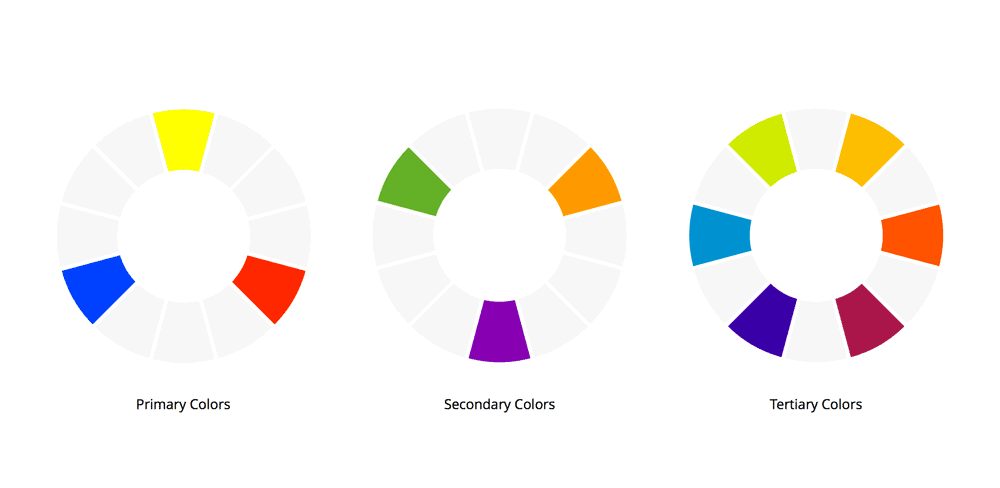
Colour is one of the single most important aspects of graphic design.
As humans, we are incredibly visual, and we rely heavily on visual communication.
Take your time to choose the right colours.
It is always a good idea to do some research into different colours as different colours set different tones and moods to your overall design.
There is a lot of research and theories out there on the significance of colours.
There is an excellent article on colour psychology out there like Color Psychology in Marketing and Brand Identity: Part 2
“Colour evokes emotions” Mydee Lasquite – Visme.co
Different colours evoke different emotions from people.
That’s why it is imperative that when you are creating that new logo or icon for a brand that you do your research into the colours to use and why you should use a specific tone if that is the way you want to go.
In saying all of the above, most of the design work that we produce is monochrome for the reasons of readability and adaptability.
4 – Contrast

Contrast is one of the keys to creating amazing graphics.
Be it black and white or black and yellow; it is essential to use the right contrast in your design.
However contrast is not only about colours, but it also covers different shapes, contrasting fonts and typography.
All these contrasts should compliment each other and bring your design together.
Contrast of sizes
One of my favourite things to experiment with is contrasting with the sizes of elements in my designs.
Having all the text the same size and font style can make designs quite dull and will not grab people’s attention.
It would help if you experimented with contrasting sizes of text, shapes and graphics that will give your design real impact.
Contrast of colour
The contrast of colour is essential to a good design.
It is essential to work with colours that compliment each other.
The worst thing to do is pick colours that are similar to each other as you cause confusion and irritation.
5 – Align your objects (Please)

Alignment can really make or break a good design.
I am not saying everything must be centred or to the left, but it has to make sense in your design.
One trick I use is to use Grids & Rulers.
6 – Font experimentation
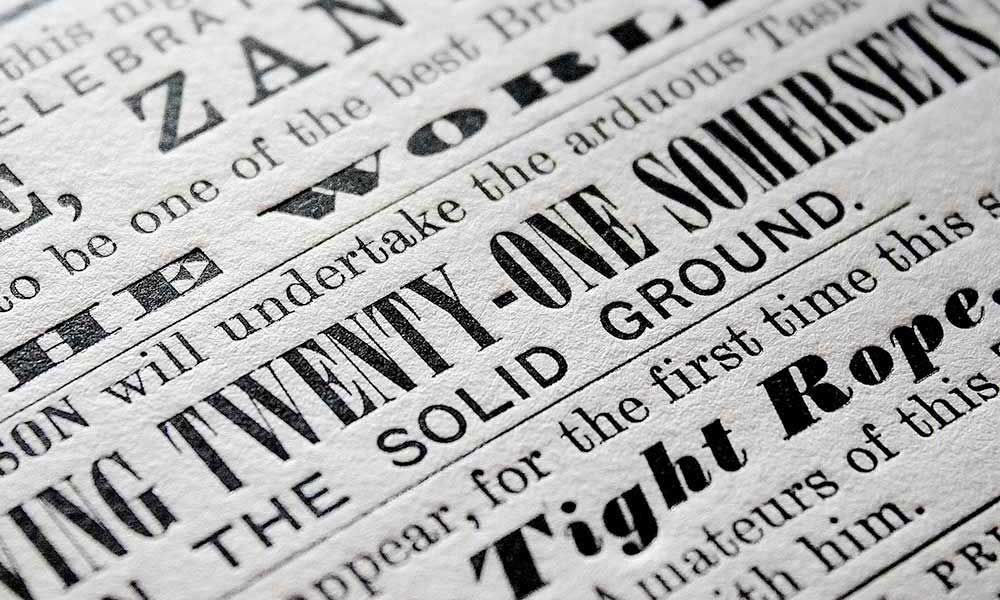
The most time-consuming tip of them all!
Often it takes us hours of experimentation to combine and find fonts that work beautifully together!
Poorly paired fonts can make a design feel uncomfortable, unfinished, or unprofessional.
Experimentation is critical, and I highly recommend allowing time for this for every design project that you take on because it will make the most significant difference to your graphics.
7 – Using Photos & Text

A good trick to know when trying to use text over a photo is to darken the picture to really make the text pop and stand out.
Nobody wants to be squinting trying to read the text because your background image is overpowering and making the words hard to read.
There is an excellent article on Design Modo – 10 Tips for Designing with Type on a Photo that goes into good detail on tips and tricks you can follow when working with photos and text.
8 – Responsive Logos
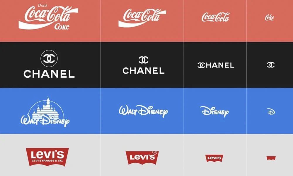
In 2018 with web 2.0 applications on the rise, companies and the design industry started to focus on Responsive Logosand Icons.
This means the logo responds to the size of the device it is being viewed on.
All of the biggest brands today now all use responsive logos and icons across all their media channels to ensure no matter what device you view them on that they have total continuity and are still easily recognisable.
Check out a cool website dedicated to responsive logos – http://responsivelogos.co.uk/ where you can change the size of your browser and these famous brands logos will all dynamically change.
9 – Movement: animations & GIFs
Add interest to ads, email newsletters, illustrations, icons and logos by taking advantage of this trend.
In particular, using this trend with social media content will generate higher levels of engagement when compared with flat image content.
10 – Gradients Rock
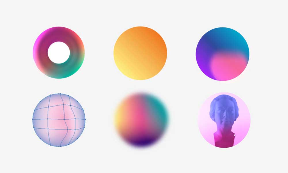
Well, this may just be my own option, but I love gradients.
2018 was really the year of gradients, and it was a trend I fully embraced in particular with metallic gradients.
If you are carrying out web or application design, I strongly recommend that you think about using a gradient in your design.
It will make your design look sophisticated, and it makes it easier for text to pop on a gradient background.
There are some really cool tools on the web now to help you pick an impressive gradient for your next web design or application.
One I use a lot is uiGradients.
This tool basically lets you select the gradient you like and gives you the Hexadecimal values of the gradient so you can recreate it in Illustrator or Photoshop.
Bonus – Cloud-based Graphic Design Software
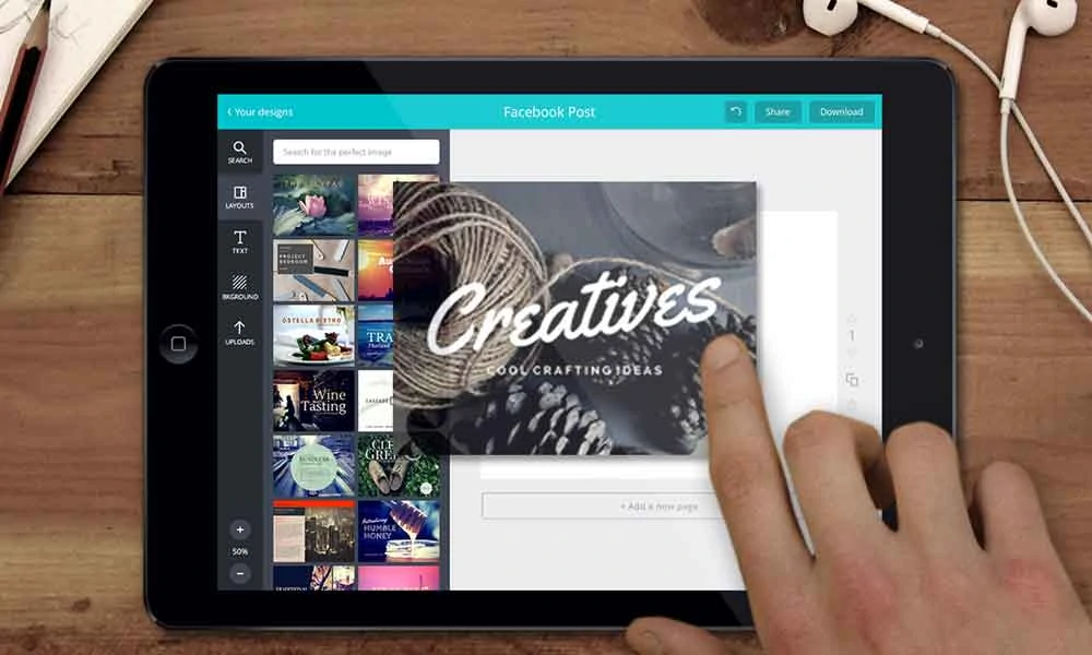
In the age of the Internet, it is only fitting that design software got with the times.
There is some really exciting cloud-based software out there that will cut your workload in half because they have a massive library of elements that you can utilise.
Do you know what the best thing of all is? They are FREE!
Here is just some of the top cloud-based Online Graphic Design Software I use:
- Canva – this website is the mecca, it is the holy grail. I have been saying it for years, “god I wish there was somewhere like iTunes or Netflix where we could just access all the elements a graphic designer needs”. Then along came Canva and I haven’t looked back since.
- Crello – this is a tool I use from time to time. Mostly when I can’t find what I am looking for in Canva.
- Sketch – this is a more advanced tool. Not really for beginners, but once you get the hang of it, it is very powerful software.
Conclusion
So In conclusion, do not be afraid to draw inspiration from other designs and designers.
Keep in mind it is an inspiration to ensure that everything you are inspired by is just that inspiration, nobody wants to see you replicate the exact design from someone else.
Make it your own!
- White space is your friend, try to keep things simple and don’t be afraid of white space.
- Choose your colour wisely as this will decide the outcome of your overall design.
- Research into the colours and explain to your client why you chose the colours.
- Try to use contrasts in your design, whether its, colours, shapes or types.
- Try to make your design dynamic and not all uniform.
- Use alignment carefully, and I recommend using a grid so you can keep everything in proportion.
- Darken photos and images to give them high contrast against the text.
- When designing logos and icons think about making responsive versions that will work on multiple media devices.
- Use icons or illustrations whenever possible to break up the text.
- If possible try to incorporate negative space into your design and really wow your clients.
- For social media content – think movement, animation & GIFs.
- Do not be afraid to use gradients whenever possible, especially in web design as it is really on trend right now.
Try to take some of this onboard when creating your next design and remember above all, have fun with it!


